Cafe label design, an essential element of branding, adds personality to beverages, as seen in brands like Stumptown Coffee Roasters. Eye-catching colors (such as the vibrant turquoise used by Blue Bottle Coffee), unique fonts (like the rustic typography of Intelligentsia Coffee), and creative graphics (including hand-drawn illustrations often used by small-batch roasters) catch the eye of customers. Labels tell stories, evoke emotions, and enhance the overall cafe experience--examples include the whimsical narratives featured on the coffee bags from Cafe Grumpy. Discover the secrets behind captivating cafe labels and how they can elevate your business, as demonstrated by the success of Peet's Coffee, which integrates seasonal themes into their label designs to resonate with their audience!
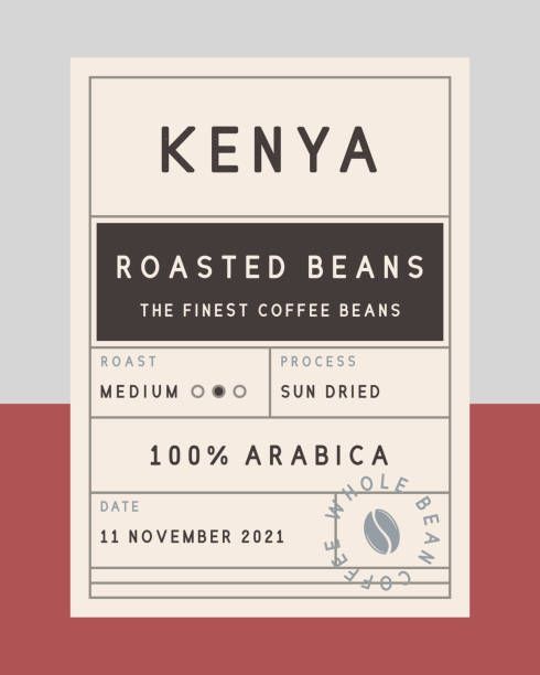
Minimalist Coffee Label Design Highlighting Quality and Origin
The design features a minimalist label that emphasizes the quality and origin of the coffee. The clean layout, with bold typography, showcases the name "Kenya" prominently, instantly drawing attention. A subtle color palette of muted tones, combined with a structured format, adds sophistication, making it perfect for a cafe atmosphere. The inclusion of details such as roast type and processing method contributes to an overall aesthetic that appeals to coffee enthusiasts, while maintaining an elegant and modern look. This design effectively communicates quality and care in coffee selection, ideal for enhancing a cafe's brand identity. Source
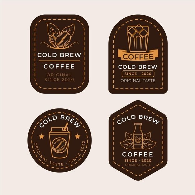
Chic Cold Brew Coffee Labels: Modern Elegance for Trendy Cafe Branding
The design features an array of stylish labels dedicated to cold brew coffee, emphasizing a modern yet classic aesthetic. Each label showcases distinct illustrations, such as coffee beans and drink icons, all rendered in a muted color palette that conveys warmth and sophistication. The use of circular and rectangular shapes creates a cohesive visual rhythm, making them suitable for branding in a cafe setting. The elegant typographic treatment adds a touch of refinement, enhancing the overall appeal while reinforcing the theme of artisanal quality. This design would effectively complement a trendy cafe environment focused on cold brew offerings. Source
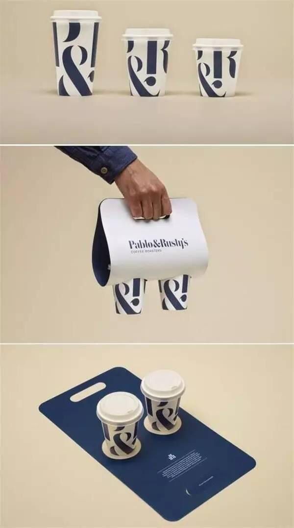
Modern Cafe Design: Sleek Branding with Bold Graphics and Elegant Aesthetics
The cafe design features a contemporary and sleek branding approach, focusing on clean lines and a modern aesthetic. The coffee cups showcase a bold and distinctive graphic pattern, prominently displaying stylized ampersands that create a playful yet sophisticated look. The color palette consists of crisp white and deep navy, enhancing the elegance of the overall presentation. The packaging not only serves a functional purpose but also adds to the visual appeal, making it attractive for customers to engage with the product. This design effectively conveys a sense of quality and creativity, perfect for a trendy coffeehouse. Source
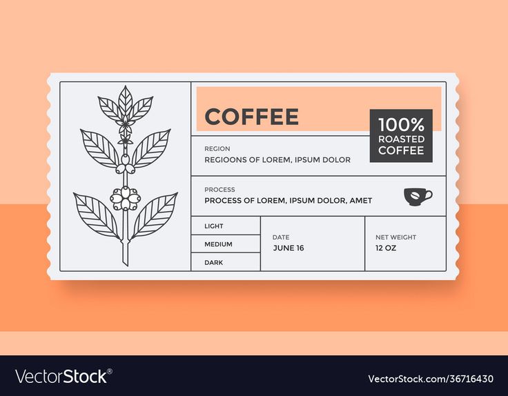
Minimalist Coffee Packaging Design: Elegance Meets Functionality
The design features a minimalist and modern style, focusing on the essential elements related to coffee packaging. The clean lines and simple botanical illustrations emphasize the natural aspects of the product. The use of an organized layout allows for clear communication of important details, creating a contemporary yet approachable aesthetic. Soft pastel colors provide a warm and inviting feel, making it suitable for a cafe setting where comfort and simplicity are key. Overall, it reflects a balance between elegance and functionality, appealing to coffee enthusiasts. Source
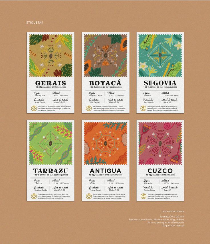
Artisanal Labels Celebrate Coffee Regions with Vibrant Designs and Cultural Essence
The image features a collection of intricately designed labels showcasing various coffee regions. Each label is adorned with vibrant, artistic patterns that reflect the cultural essence and rich biodiversity of the respective areas. The use of earthy tones combined with lively colors creates an inviting and warm aesthetic, perfect for a cafe setting. The overall design emphasizes the unique characteristics of each coffee region, making it an appealing visual element for patrons interested in exploring different coffee flavors and origins. The labels convey a sense of attention to detail and an appreciation for the craft of coffee production, enhancing the cafe's ambiance. Source
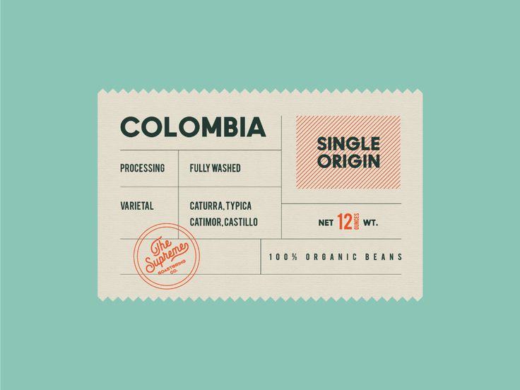
Crafting an Inviting Cafe Aesthetic: A Blend of Simplicity, Authenticity, and Sustainability
The design elements suggest a focus on simplicity and authenticity, ideal for a cafe setting that highlights quality coffee. The muted color palette, featuring a soft mint background, creates a calming atmosphere, inviting customers to relax. The use of a vintage-inspired label with decorative borders and a clear typographic hierarchy communicates a sense of craftsmanship and attention to detail, perfect for showcasing specialty coffee offerings. This aesthetic, combined with references to organic and single-origin beans, emphasizes sustainability and the artisanal nature of the product, appealing to discerning coffee lovers seeking a unique experience. Source
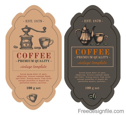
Vintage-Inspired Cafe Labels Combining Nostalgic Charm and Premium Quality
The design features two vintage-inspired labels that evoke a warm and nostalgic atmosphere for a cafe. One label, in soft cream tones, showcases an illustration of a coffee grinder alongside a steaming cup, while the other, in deep charcoal, displays an elegant teapot and cup. Both labels have an ornate shape, highlighted by classic typography that emphasizes the premium quality of the coffee, suggesting a focus on craftsmanship and tradition. The overall aesthetic combines rustic charm with a timeless appeal, perfect for a cafe that values heritage and quality in its offerings. Source
Stylish Minimalist Logo Designs for Cafe Branding: Inviting Graphics that Reflect Warmth and Quality
The collection of logo designs showcases a range of stylish and modern graphics ideal for a cafe's branding. These designs utilize a minimalistic black-and-white palette, emphasizing clean lines and versatile shapes that convey an inviting atmosphere. Various elements, such as coffee cups, steam graphics, and playful typography, enhance the visual appeal while communicating attributes of warmth and quality. Each logo facilitates easy adaptability, making them suited for signage, menus, and promotional materials, thereby establishing a cohesive identity that resonates with coffee lovers. Source
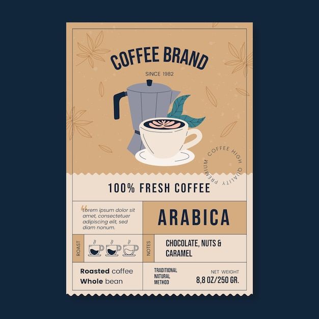
Warm and Inviting Cafe Design Featuring Earthy Tones and Cozy Elements
The design features a warm and inviting aesthetic suitable for a cafe, using earthy tones and a simple yet elegant layout. Central to the design is a stylized coffee cup atop a minimalistic coffee pot, conveying a sense of coziness. Decorative elements, such as leaves and subtle patterns, enhance the organic feel, suggesting a connection to nature and freshness. The overall composition balances text and imagery, creating a welcoming atmosphere that emphasizes quality and artisanal coffee. Source
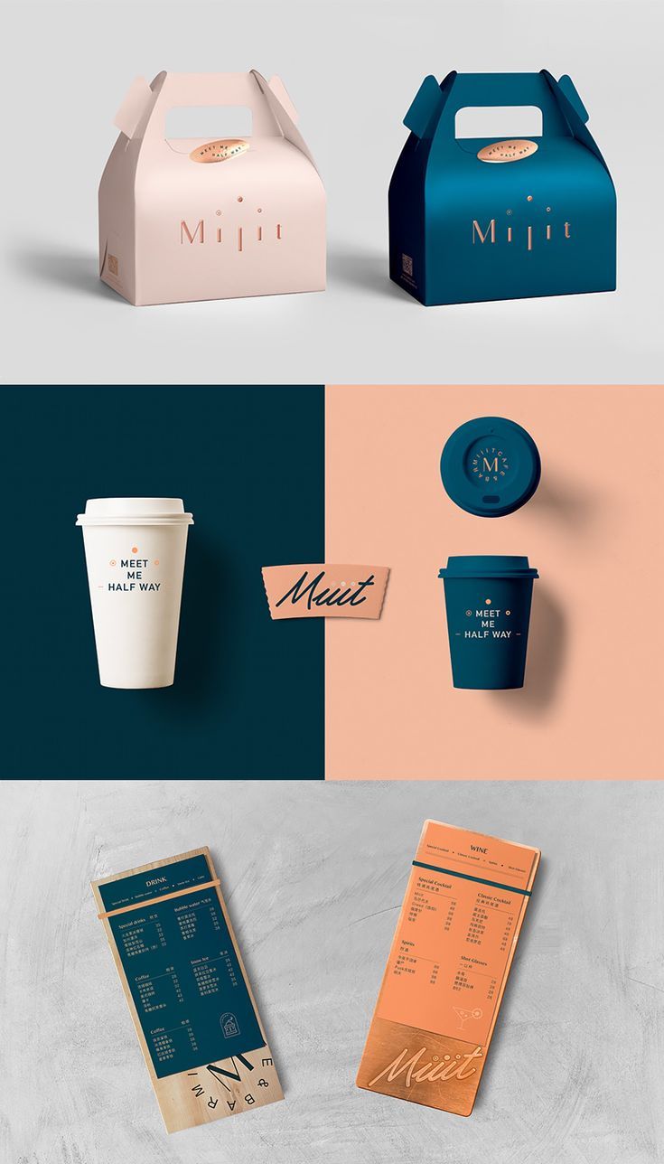
Modern Minimalist Cafe Design with Cohesive Branding and User-Friendly Aesthetics
The cafe design features a modern and minimalistic aesthetic, highlighted by a harmonious color palette of teal, peach, and cream. The packaging elements, including a stylish gable box and various cup designs, showcase a blend of elegance and functionality. Each item maintains a cohesive branding theme, with clean lines and sophisticated typography, creating an inviting atmosphere. The menu presentation utilizes contrasting colors and sleek materials, reinforcing the contemporary vibe while ensuring a user-friendly experience for customers. Overall, the design exudes a fresh and stylish identity, making it visually appealing and memorable. Source




Comments